
One of my lesser-known talents is my psychic ability. Here, I’ll prove it with a prediction. I predict you’re reading this on a mobile device. Am I right?
Ok, confession time. I believe in psychics about as much as I believe in my labradors ability to resist leftover roast chicken that gets accidentally dropped onto the floor. What I do believe in is research, science, and statistics. In this case, statistics were in my favour.
These days, people spend on average 53% of online time on a mobile device, therefore my psychic prediction had a 53% chance of being correct.

If you’re reading this on a desktop, you’re in the minority. And, since most of us consume the majority of our online content on our mobiles, it’s no surprise that mobile SEO forms an essential part of any good SEO strategy.
In fact, Google now prioritises the mobile version of a website with mobile-first indexing. If your SEO isn’t up to scratch on your mobile site, your ranking is at risk.
What is Mobile SEO?
Mobile SEO is the process of optimising websites for search engines on mobile devices. It encompasses a lot of the same practices as regular SEO, though there are a few extra things you should consider when enhancing a mobile user’s online experience.
Since the main difference between desktop browsing and mobile browsing is the size of the screen, most mobile SEO best practices revolve around adapting the website design and content to work well on screens of different dimensions.
Is Your Site Mobile-Friendly?
You can check if your website is mobile-friendy using the Google Lighthouse. This free SEO tool will tell you if there are any issues with your mobile site, for example, if there are links too close together.
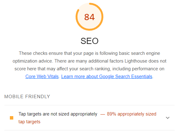
You can then use this information to make updates to your site to enhance the user experience on mobile.
Configuring Sites for Mobile
When configuring a website for mobile you have three main options. These are responsive design, dynamic serving, and separate URLs. Let’s look at each of these options and assess how they compare to each other:
Responsive design
Responsive design is a method of configuring your site for mobile that’s considered the easiest to use from both a developer and user point of view. It’s also the type of configuration that’s recommended by Google.
With a responsive design, you can deliver the same page to both desktop and mobile users.
The HTML code remains the same, but the CSS automatically alters how the page looks on each device, rendering it in a way that is most appropriate for the screen size. This can decrease load time because it means users don’t need to be redirected based on their device, and it also means pages can be shared using a single URL rather than a mobile-friendly URL.
Responsive designs also minimise the chance of mistakes appearing on mobile sites, and they are significantly easier to maintain compared to alternative options.
Dynamic serving
With dynamic serving, the URL remains the same, but the HTML changes depending on the user’s device.
If you’ve ever been directed to a desktop version of a website on your mobile device, even though a mobile site exists, this was a result of dynamic serving. It’s fairly common for the wrong version of a website to mistakenly appear, which of course is a thumbs down for user experience.
Separate URLs
You can have separate URLs for your mobile and desktop sites if you want the two sites to appear distinctly differently.
Typically this involves using the word ‘mobile’ or simply an ‘m’ in the URL designed for use on mobile devices.
For example, the desktop URL could be yourwebsite.com, while the mobile-friendly version could be mobile.yourwebsite.com.
This option of mobile configuration is not recommended by Google, since it can cause plenty of SEO issues that time and effort to resolve. Most notably, it requires HTML tags to be correctly used to communicate to Google which pages are for mobile and which are for desktop, otherwise, content can be assumed to be duplicated. This can harm your SERP ranking, and create an unnecessary job for your website manager or developer.
Tips for Mobile SEO
To ensure your website is mobile-friendly, consider trying out these top tips:
Mobile-Friendly Content Creation
When you’re creating content for your website, have mobile users in mind.
Since mobile devices have smaller screens than desktops, the information a mobile user sees will be quite different from that of a desktop.
A paragraph that looks manageable on a desktop might look like an essay on a mobile device. Aim to keep sentences short to make content easy to read on a mobile.
Headers and subheaders will also make it easier for mobile users to skim content. Remember to break up paragraphs with empty space and images so your readers don’t feel overwhelmed with text.
Page Speed
Page performance, or the speed at which your website loads on a mobile device, is taken into consideration when Google is ranking relevant results. You can check how well your page is performing using PageSpeed Insights by Google.
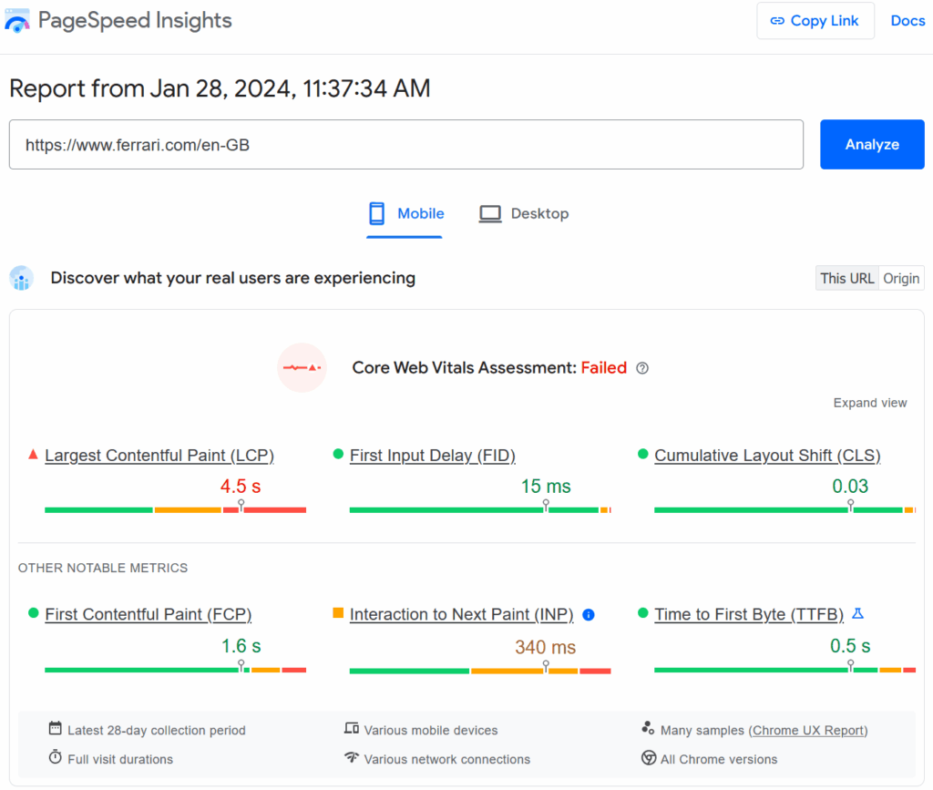
Simply input your URL to get an audit of how fast your website has been loading on both mobile and desktop devices.
Voice-Friendly Keywords
Voice searches are becoming increasingly popular among mobile users, and this can affect the types of keywords you need to use in your content.
Users typically use a more casual approach when using voice searches compared with a typed search.
For example, when typing a search into Google you might input ‘pizza delivery near me’, whereas when using the voice command you might say something like ‘where is the nearest pizza delivery place to me’. This change in user behaviour can mean long-tail keywords are more effective for mobile SEO.
Avoid Pop-Ups
On mobile devices, pop ups can completely dominate the screen and damage the user experience. For this reason, pop-ups are usually best avoided on mobile devices, unless they only occupy a small portion of the screen.
Since Google prioritises user experience, the use of pop-ups can negatively effect your SERP ranking, and of course dissuade visitors from coming back to your site.
Title Tags and Meta Description Optimisation
Click-worthy title tags and meta descriptions can increase traffic to your website from search engine results.

To optimise these for mobile devices, consider their length. Title tags should be between 50 and 60 characters long, otherwise they won’t fit and Google will re-write it for you. For meta descriptions, keep the character length under 140.
With This in Mind
SEO for mobile is absolutely crucial for anyone in the online world to succeed.
One more time for those in the back: mobile SEO is essential to online success. The amount of users accessing online content on a mobile device is at an all-time high, and this is only expected to increase in the coming years.
Need a hand getting your website optimised for mobile? Contact us for bespoke advice.