
Building a sleek and stunning Shopify store is no mean feat.
It’s the first step in forging an online presence, and it’s going to be pivotal in the success of your e-commerce business.
But how useful is a kick-ass website that nobody can find?
As my nan would say, about as useful as a chocolate teapot.
That’s where SEO comes in.
Here we delve into the depths of Shopify SEO so you can optimise your store to get more traction on search engines.
What Makes Shopify a Good Choice for SEO?
When people first hear terms like XML sitemaps, robots.txt, metadata, canonical URLs and SEO settings, it can quickly start to feel… a bit too much.
One of the advantages of Shopify is that many of these important SEO features are already built in. You do not need to install a separate SEO plugin just to get the basics in place.
That does not mean Shopify does everything perfectly, or that you can ignore SEO completely. However, it does give you a strong starting point. Your store can automatically generate sitemaps, give you control over page titles and meta descriptions, and manage key technical files like robots.txt.
Let’s look at a few of these built-in SEO features and why they matter.
Shopify SEO Tutorial Contents
- Shopify’s XML Sitemap
- Metadata Fields
- robots.txt
- Structure Your Site
- Choose a Shopify Theme
- Conduct Keyword Research
- Product Variants
- Create Compelling Product Descriptions
- Set Your Domain
- Optimise Images
- Perform Data Markup
- Continually Monitor
Shopify’s XML Sitemap
A sitemap helps search engines discover the important pages on your website. In Shopify, this is created automatically, which means you do not need to build it manually or install a separate plugin.
You can usually access it by visiting:
https://yourwebsite.com/sitemap.xml
Just replace yourwebsite.com with your own domain name.
Although Shopify’s sitemap setup is not perfect, it gives your store an important SEO foundation from the start.
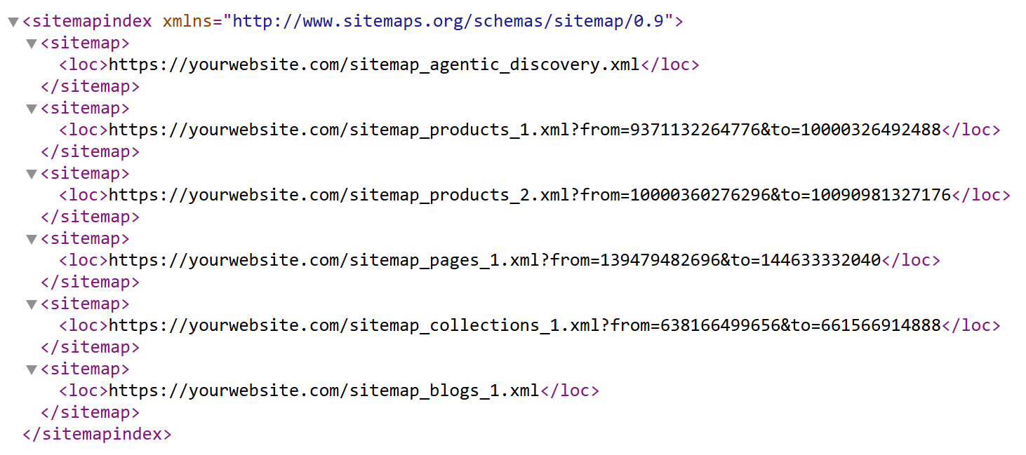
Why this is good
- You can submit the sitemap to Google Search Console.
- Shopify segments larger stores into separate sitemap files, which helps search engines process the site more easily.
- The sitemap structure is automatic, so new products, pages and collections can be added without manual work.
- Shopify’s sitemap setup is evolving, including newer sitemap files such as
sitemap_agentic_discovery.xml.
What is not so good
- The collections sitemap could be more detailed, especially for larger stores.
- Shopify does not create a separate author sitemap, which could be useful for E-E-A-T signals on content-heavy stores.
- There is no dedicated brand sitemap by default.
- You do not get as much sitemap control as you would with some WordPress SEO plugins.
Metadata Fields
You do not need a special SEO plugin in Shopify to edit your page titles and meta descriptions. Shopify already gives you fields for these inside products, collections, pages and blog posts.
This is important because metadata helps control how your pages appear in search results. Your page title can influence rankings and clicks, while your meta description can help persuade someone to visit your page instead of a competitor’s.
Shopify can automatically populate these fields, but relying on that is not recommended. It may simply pull text from your product title, page content or description. That is rarely the best version from an SEO or sales point of view.
This is where you can improve your search result. Write your own page titles and meta descriptions so they are clear, relevant and more appealing to potential customers.
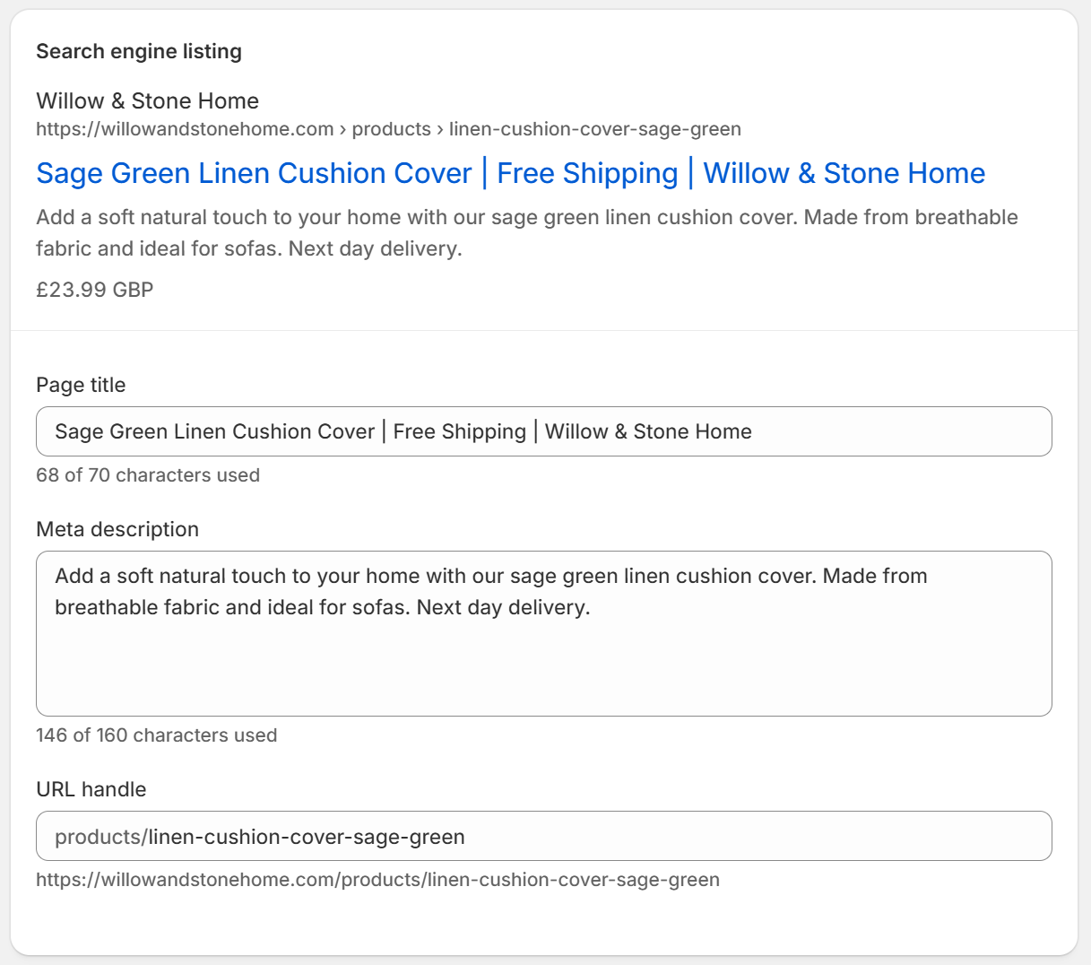
Important note: Even though Shopify gives you these fields automatically, you still need to use them properly. The default version is usually not the strongest version.
For example, instead of letting Shopify create a basic title, you can write something more targeted:
Basic:Sage Green Linen Cushion Cover | Willow & Stone Home
Stronger:Sage Green Linen Cushion Cover for Sofas & Beds
The stronger version includes the product type, colour and use case, which makes it more useful for both search engines and shoppers.
Title tag and meta description optimisation can help with your search engine ranking, and also improve your click-through rate.
robots.txt
Shopify also creates a robots.txt file for your store. This file gives search engines instructions about which parts of your website they can and cannot crawl.
For most Shopify stores, you do not need to edit this file. Shopify handles the standard version for you, and that is enough in most cases.
You can view it by visiting:
https://yourwebsite.com/robots.txt
Again, replace yourwebsite.com with your actual domain.
When would you edit robots.txt?
You may only need to edit it in specific situations, such as:
- You want to block search engines from crawling certain filtered or internal URLs.
- You have a custom SEO setup and need more control over crawl behaviour.
- A developer or SEO specialist has identified crawl waste or indexing issues.
For most store owners, this is something Shopify handles in the background.
Where Shopify Still Needs Manual SEO Work
1. Structure Your Site
I know what you’re thinking, surely the first step of our journey is to put together some wireframes to map out the framework of our key pages? Or maybe you’re expecting some UX principles or heuristic advice to keep you on track and maximise that all-important conversion rate. That, however, is a long way down the road.
In fact, the first step to a successful e-commerce website build is one that we see people omit entirely time and time again. The ironic thing is, it’s the most fundamental and an absolute non-negotiable. So, what exactly does it mean to map out a site structure, and why is it so important?
The structure of a Shopify store, much like any eCommerce store, needs to be easy to navigate to make it user-friendly.
An intuitive structure is also easier for search engines to crawl and index, so it’s a double win as a website owner. A pyramid-style structure works best for most eCommerce stores, For this, you have your homepage at the top of the pyramid, which leads to category pages. Each page leads to a subcategory, and each subcategory leads to products.
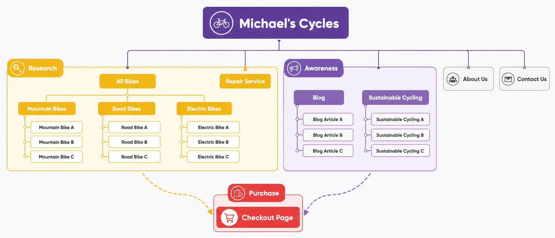
Good Website Structure Example
It’s probably best to show you. This is a site structure of the fictional bicycle company “Michael’s Cycles.” This is an example of a well-thought-out, logical site structure that helps the user easily navigate the site in a way that makes sense.
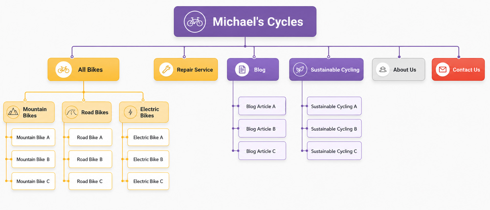
If you imagine the main topics are all found in the header of the website, you can see that what comes below them follows reason. Within the “All Bikes” section, you find three distinct bike categories with segmented products in each. You also have Michael’s key page “Repair Service” present along with a blog and a separate section on sustainable cycling – Michael’s very passionate about sustainability and uses it as a USP for his site; he constantly sends his visitors back to this section via social media and email marketing to strengthen his brand. He also has the key supporting pages “About Us” and “Contact Us” in the header.
Not only does this seem a very logical structure for users visiting the site, but search engine bots love this too. They understand how to get to every page, what it’s about, and can follow the structure very easily. This means that site structure before we even get on to “classic UX” affects the user experience and SEO before a single square or circle has been placed on a wireframe.
Bad Website Structure Example
Now take a look at a rival company, Neil’s Wheels:
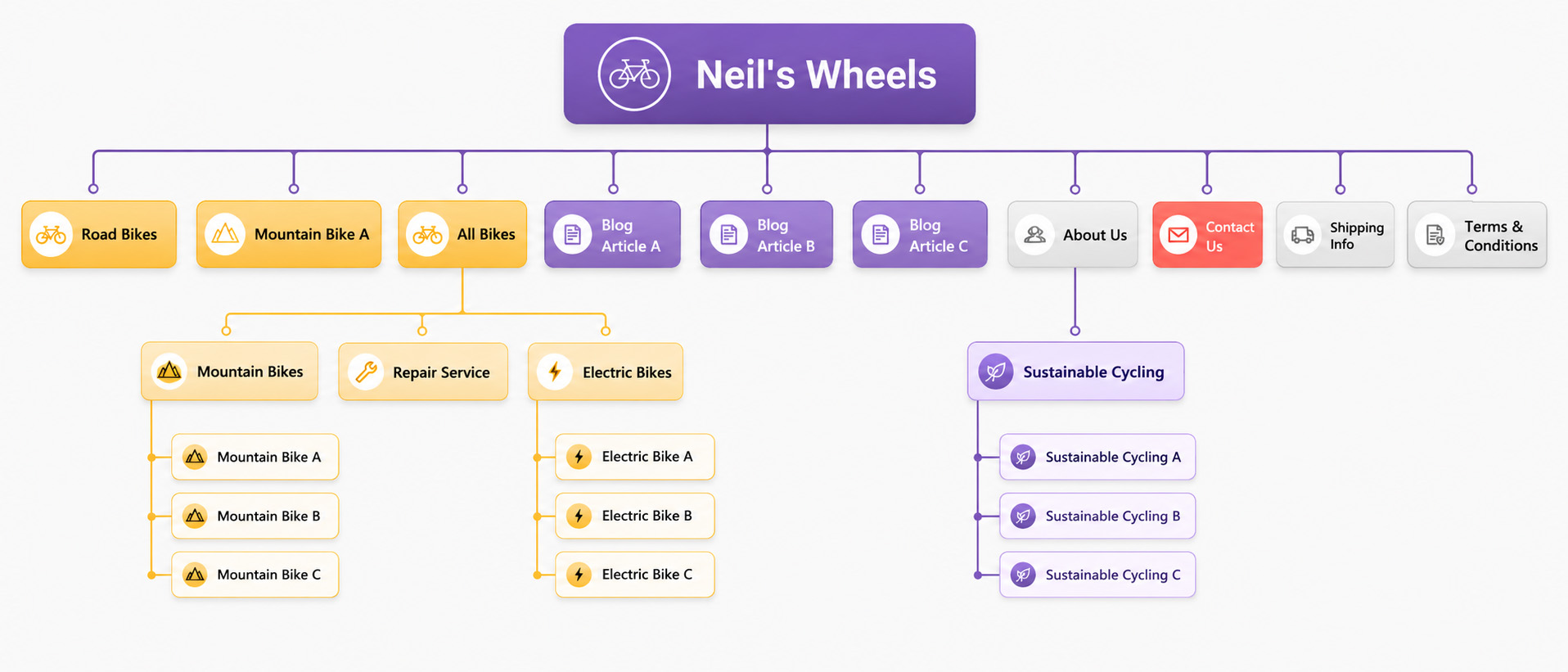
Neil, for the sake of this example, happens to have all the same pages that Michael has on his site. However, the structure of this website is much more confusing, for visitors and crawler-bot alike.
Let’s look at the “All Bikes” section to start with. You can see that we have the mountain bikes and electric bikes categorised under the main “All Bikes” section as before, but now we have road bikes and Neil’s best-selling mountain bike – mountain bike A – in the header too. There are a number of reasons why Neil has decided to do this, perhaps he’s got a lot of road bikes in stock and he wants to draw more attention to them? Whatever the reason, it’s quite confusing to see an “all bikes” section in the header and find two pages that should logically fall somewhere under this section outside of it. Furthermore, Neil’s repair service is also under “All Bikes” despite it not being a bike! Confusing, eh?
If we now look at the blog, we’ve lost the main blog section altogether and now have blog articles in the header. Are these articles really all that important for them to be listed in the header? And now Neil’s “Sustainable Cycling ” section is under “About Us,” which sort of makes sense but I would argue this is better suited to being a main option in the header. Finally, “Shipping Info” and “Terms & Conditions” have made their way into the header when they should really be in the footer. These are not key pages on the site, necessary – yes, but not strong indicators to search engines about what Neil’s site is all about, and not particularly interesting to a visitor unless they’re looking for them specifically (and the first place they’d go is likely to be the footer in any case).
Real Life Examples
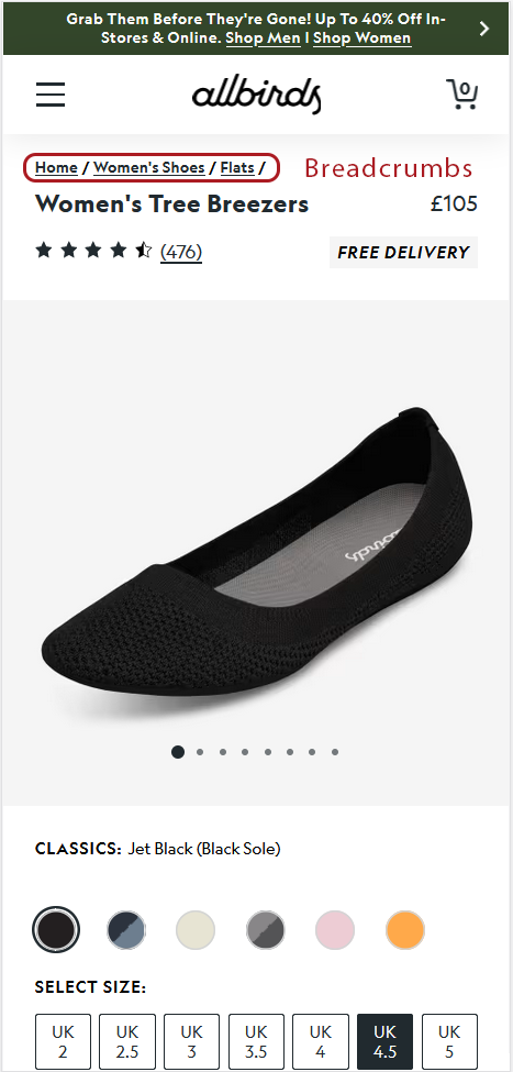
One of the most visible places where you can see a good website structure (not just in your wireframes) is the mega menu.
And one of the most unexpected places you will see it is in the breadcrumbs.
How Website Structure Helps with the Customer Acquisition Funnel
If you’ve worked in marketing or business development before, you’re likely to have heard of the customer acquisition funnel. This maps out the typical customer journey from the awareness stage, when they first hear about the product they want to buy, to the purchase stage. Of course, you can break down the funnel into many iterative stages, but for this example, we’ll just focus on the three stages in the diagram below: awareness, consideration and purchase.
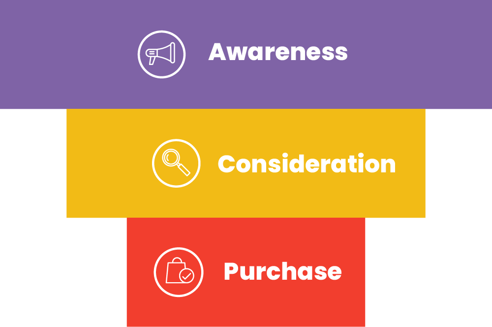
So what’s the relevance to our foundational website structure? Well, we can map out which pages of the website are related to what stage of the acquisition funnel and, from there, work out where we want website visitors to go having arrived on a specific page. If you take a look at the below diagram of Michael’s Cycles, you can see that the customer journey is fully visualised.
The blog pages are highlighted in purple as this correlates with the awareness stage. This is the kind of page that the customer is landing on if they are still considering whether to invest in a new bike or not. Perhaps they’re searching for terms like “health benefits of cycling to work” or “is cycling sustainable?” The pages highlighted in orange are the product and product category pages. This is because the visitor has already made up their mind that they are going to buy a bike at some point, but are now researching to find out which to buy. Visitors may land on these pages directly or may reach here having come from another page on Michael’s website that features earlier in the customer acquisition channel.
Finally, you have the checkout page, which should be self-explanatory and is only reached having visited the product pages and added a product to the cart. The homepage is a bit of a maverick when it comes to the customer acquisition funnel, as people may reach here at many different stages of the customer acquisition funnel.
The reason why this is all so relevant to site structure is that we can now see where we want to push people to reach the next stage in their journey. For example, if a person lands on Michael’s regular or sustainability blog, we now know that we want to get them from the awareness stage of the funnel to consideration. By using call-to-action buttons and internal linking, we can guide visitors from these pages to the product pages which represent a much higher page value.
In addition, we can also capture customer information from these pages and feed them back into the loop using marketing automation. We can do this via email drip-feeds. Imagine if we have an exit-intent pop-up on a blog page that captures emails. We then segment these customers into an email list called “blog visitors” and send them a series of follow-up emails that encourages them to take a look at some best-selling products. We have now recaptured some potential customers that would otherwise have been lost and moved them along to the next stage of the customer journey!
2. Choose a Shopify Theme
Now that we have our site structure in place, we can now start to think about what our store is going to look like. First, though, it is important to remain grounded.
A common mistake we see when companies get excited about eCommerce website development is the tendency to overdesign.
And this greatly complicates their SEO.
Shopify provides pre-built functionality and stylish easy-to-use theme designs. What’s more, some of newer premium templates (such as Hyper) have been developed with user experience and SEO in mind, and typically have great site speed and performance.
With this in mind, let me ask you this. Why on earth would you want to go and completely design a Shopify theme from scratch by customising every part of your site? You wouldn’t – unless that is, you’re part of a bigger organization with very specific design and functionality needs and a team of professional website designers and developers.
In the case of Michael’s Cycles, a standard Shopify theme will do just fine.
3. Conduct Keyword Research
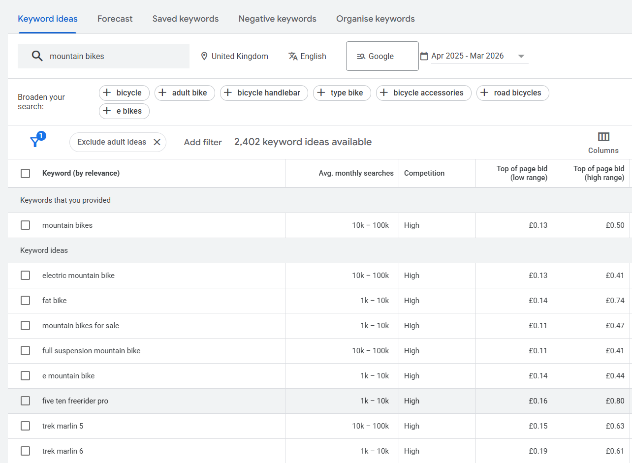
Keyword research involves finding the most popular words or phrases that your target audience is likely to search to find products like yours. You can use Google Keyword Planner for help with this, or conduct your own keyword research by inputting search terms into Google and looking at ‘Related Searches’.
Once you’ve determined which keywords you want to focus on for each page you can ensure they’re included in product descriptions, title tags, and meta descriptions in a natural way. Avoid stuffing your content with keywords as search engines can recognise and penalise your site for this.
4. Product Variants
You’re likely going to list some products on your Shopify store that are the same item with slight variations. For example, you might be selling snakeskin boots in variations of black or tan. Shopify guides you to set this up as a single product with variants, but in doing this it will create a URL with ‘?variant=$id’ at the end. For example, the black snakeskin boots might have a URL like this:
exampleshop.com/products/snakeskin-boots?variant=6638600
And the tan snakeskin boots might have a URL like this:
exampleshop.com/products/snakeskin-boots?variant=8238641
This becomes an issue if a user is searching for a specific variant, and it could affect your ranking result for that product. Short, descriptive URLs containing relevant keywords are more likely to rank higher in search results. Because of this, it’s better to set up these variants as two entirely separate products. Then your URLs can look something like this, making them easier for both search engines and users to understand what they’re about:
exampleshop.com/products/black-snakeskin-boots
exampleshop.com/products/tan-snakeskin-boots
5. Create Compelling Product Descriptions
Product descriptions should inform customers while also including relevant keywords naturally. Unique and clear product descriptions work best for both user experience and SEO since they not only appeal to customers but also help search engines understand the context of your products.
But what exactly makes a good product description in the era of AI, where with a simple prompt we can generate hundreds, if not thousands, of words of content for each of our products and collection pages?
Well, believe it or not, nothing has changed.
Just as before, your customers want to learn useful facts about the product before buying. Even impulse shoppers who do not read too much still notice the text.
Your job is to provide them with useful information that helps them decide whether this product is right for them.
And if you are asking yourself about the quality of the content, just think: if your copy persuaded them to buy, would they come back again later because they were happy with the value proposition?
If yes, you did it right.
What happens if you still fail at this and focus on word count rather than usefulness?
It might work for a short time, but not for long, because Google and other search engines now have their own content quality reviewers: AI.
6. Set Your Domain
Your Shopify store will be accessible via several different URLs. For example, users could reach your store using any of the following:
- exampleshop.com
- https://www.exampleshop.com
- https://exampleshop.com
- www.exampleshop.com
- exampleshop.myshopify.com
To avoid diluting link equity, which can affect SERP rankings, you should set your preferred domain. This is known as ‘domain canonicalisation’. You can do this by logging into your Shopify account and navigating to ‘Domain Settings’. From here, you can select your preferred domain by clicking ‘Set as primary’.
7. Optimise Images
Image optimisation is an important, and often forgotten, part of SEO.
To optimise your images for Shopify, be sure to use clear, appealing images that show your products in their best light. Images should be high resolution for improved user experience, but ideally, these should be compressed to help with page loading speed.
Remember to use alt text on all of your images, as this helps to put them in context for search engines, and can also be useful for users who cannot see the images.

Not so long ago, Shopify introduced AI to help you populate your image alt text.
Unpopular opinion: we don’t recommend relying on it.
Why? Because the meaning of an image depends on context. More specifically, your alt text should describe exactly what you are selling.
Let’s look at one example. For this small case study, we sourced a stock photo from Shutterstock.
Even a simple image with no background elements seems to be a challenge for Shopify.
In the screenshot below, Shopify suggested the alt text: “Woman wearing a pink dress against a gray background.”
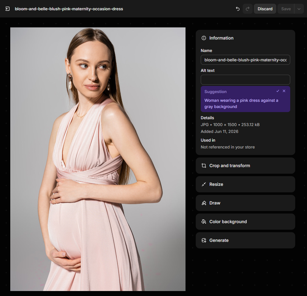
But we are not selling grey backgrounds. So this is not what we want to communicate to search engines, AI tools, or people using assistive technology such as screen readers.
A better example would be: “Blush pink maternity occasion dress for pregnant women by Bloom & Belle”
This describes the actual product, the colour, the purpose, and the brand.
Note: we will continue to monitor Shopify’s AI alt text feature, as we maintain Shopify websites daily. If this feature improves, we will update this article and revise this section accordingly.
8. Perform Data Markup
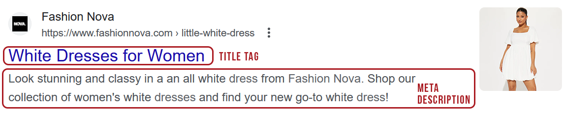
Structured data or Schema markups are beneficial to Shopify users because they give search engines a deeper understanding of your content, making it more likely to rank well in results.
It can also enable rich snippets in search results, which typically improves click-through rates, giving you more opportunity to convert visitors into paying customers, Most themes in Shopify already support Schema, so you just need to make sure you are thoroughly filling out all of your product information, such as price, inventory, etc.
The rich snippets can be seen in these search results beneath the meta description. Rich snippets can include such information as price, star rating, reviews, stock quantity, and delivery information.
9. Continually Monitor
A crucial part of Shopify SEO is continually monitoring the way users are responding to your site.
You can make use of GA4 to track your website’s performance and make adjustments accordingly when needed.
The best thing about GA4 is not that it simply tells you how many visitors you had and where they came from. You can dig much deeper and find really important information.
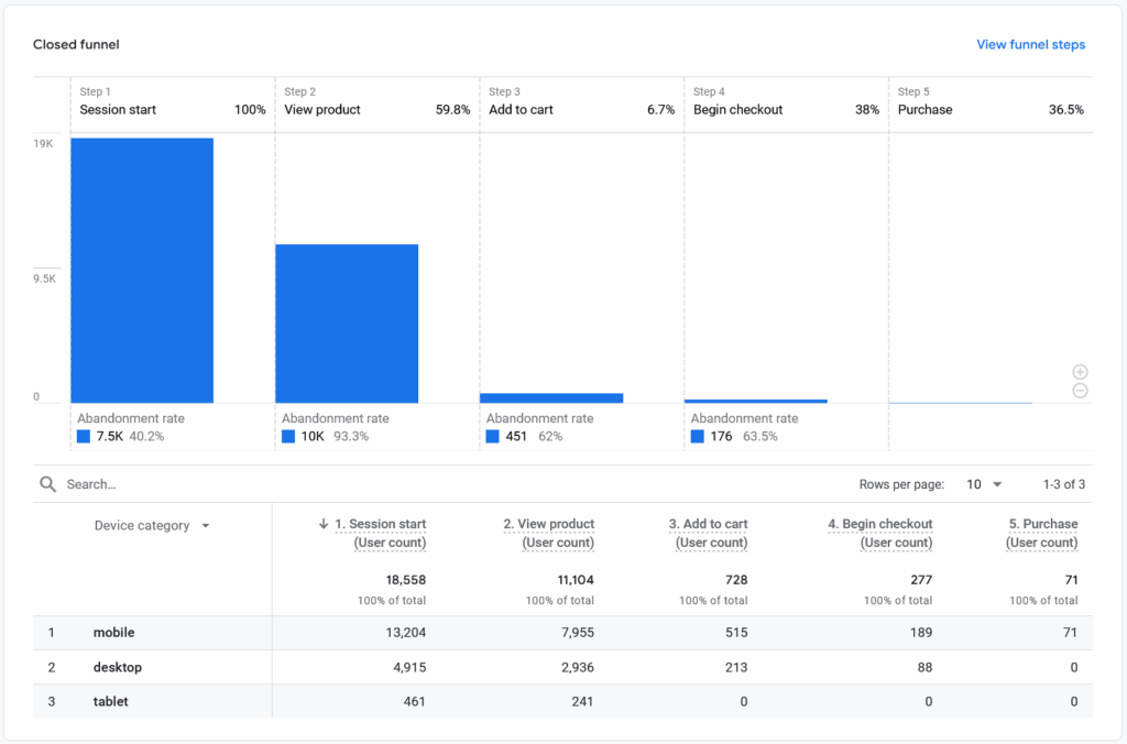
One report I would recommend looking at is the purchase journey.
As you can see in this illustration below, there are several steps from a visitor landing on your website to placing an order.
Sometimes, it is not just about getting more visitors to your website. It is simply about optimising the journey.
Put yourself in your customers’ shoes and test it. Are there any issues?
Here are some practical but often overlooked tips you can implement to improve the purchase journey. Some of these affect SEO directly, such as breadcrumbs and clearer internal navigation, while others mainly improve user experience and conversion rates by making it easier for visitors to find products, understand the journey and complete a purchase:
- Make the search bar prominent. Our personal preference is centre-aligned and always visible on all pages, except single product pages on mobile, rather than hidden behind a magnifying glass.
- Make sure your breadcrumbs stand out as a vital part of navigation, not just a decorative element.
- Avoid uppercase text. You do not want to look like you are shouting at your customers, and uppercase text can also be more difficult to read.
- The colour of primary CTA buttons should contrast with the website’s main colour palette, or use colours that are not overused across the website.
- A similar rule applies to the cart icon, which usually sits on the right-hand side of your Shopify website header. Make sure it is prominent by using contrasting colours or colours that are not overused on your website.
- Consider introducing a free delivery threshold. Amazon Prime has made this a standard expectation, and we can argue that many of your customers are probably used to it.
Shopify and Page Speed: Helpful, But Not (Fully) Automatic
Shopify does helps with the foundation (as it’s well coded and their servers are exceptionally good), but the final result still depends on how the store is built.
Things that can affect Shopify page speed include:
- The quality of the Shopify theme.
- Image size and compression
- Number of installed apps
- Large homepage banners or videos
- Too many product sections, sliders or animations
- Tracking scripts and third-party tools
- The complexity of product and collection pages
Note: Testing your homepage once with PageSpeed Insights is not enough. You should continually monitor your website’s Core Web Vitals in Google Search Console to make sure your site performs well across all pages, not just a single page.
Final Words
Setting up your Shopify platform and optimising it for search engines can be the difference between a failed attempt and an enviable success story. Use this guide to help you build the foundation blocks for your Shopify store, upon which you can continue to grow and expand.
Have any questions about Shopify SEO or need some support to get your Shopify store off the ground? Get in touch with us today.