


An ecommerce website can look polished and still make buying unnecessarily difficult.
Customers may struggle to find the right category, understand the filters, compare similar products or work out what delivery will cost. None of these problems seems dramatic in isolation. Together, however, they create hesitation at every stage of the buying journey.
That was the challenge we found when reviewing Bathroom Store Ireland, a Shopify retailer selling bathroom furniture, shower enclosures, baths, taps and accessories throughout Ireland.
Our original ecommerce UX audit ran to 35 pages and documented more than 80 observations across the homepage, navigation, collection pages, product pages, basket and checkout. Some were straightforward bugs. Some were evidence-based improvements. Others were ideas that needed to be tested rather than treated as universal rules.
The document itself was only the beginning. The real value came from prioritising the findings, implementing the right changes and continuing to improve the store over time.
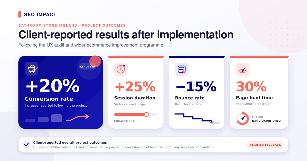
The figures below are taken from the client’s verified feedback on Clutch.
Following implementation, the client’s verified feedback reported a 20% uplift in conversion rate, a 25% increase in session duration, a 15% reduction in bounce rate and a 30% improvement in page-load time. These were results from the project as a whole—not proof that one button, filter or navigation change produced the entire uplift.
You can see the shorter commercial summary in our Bathroom Store Ireland case study. In this article, we are opening up the process and looking at 12 of the most useful lessons for other ecommerce businesses.
1. Make site search easy to see and easy to use
Site search should not feel like a secondary feature on a store with a large product catalogue.
Customers may arrive knowing that they need a 900mm shower door, a wall-hung vanity unit or a particular Radaway product. Forcing them to open an icon before they can even enter that information adds an unnecessary step.
The original Bathroom Store Ireland audit therefore recommended replacing the small search icon with a visible search field. The current desktop header now includes a prominent field inviting visitors to search products, brands or categories.
Visibility is only the first part of good ecommerce search. The search engine also needs to understand:
- Exact product names and model numbers.
- Common category terminology.
- Singular and plural versions of words.
- Frequent misspellings and alternative spellings.
- Searches for attributes such as colour, size and finish.
- Non-product searches such as delivery, returns or contact information.
Baymard’s current ecommerce search research reports that roughly half of test participants use search as their preferred product-finding method, while 56% of the sites in its benchmark still provide a mediocre or worse search experience.
Action: Make the search control immediately visible, give the field a useful prompt and regularly inspect internal search data. Look for searches returning no results, repeated reformulations and product terms customers use differently from the business.
Measure: Search usage, no-result rate, search-to-product click-through rate and conversion rate for visitors who use search.
Header: Before

Header: After

2. Organise navigation around customer decisions
Navigation should reflect how customers shop—not simply how products happen to be stored in Shopify.
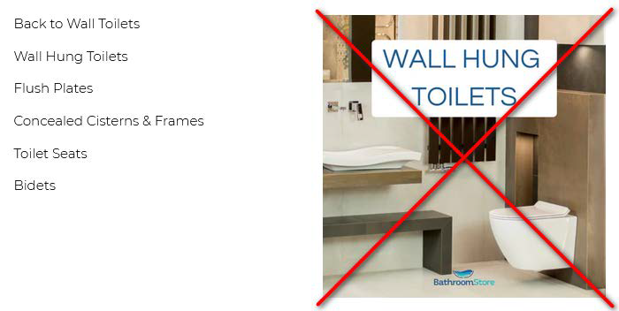
A bathroom customer may begin with a product type, such as shower doors. Another may already know the required size, finish or installation method. A useful menu supports these different routes without presenting one long, undifferentiated list.
This is also fundamental to a sound Shopify site structure: customers and search engines should both be able to understand how categories, subcategories and products relate.
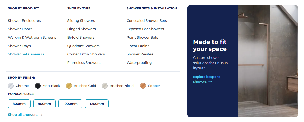
The current Bathroom Store Ireland mega menu is grouped using labels such as “Shop by Product”, “Shop by Type”, “Shop by Finish” and “Popular Sizes”. That helps turn a large catalogue into a series of smaller decisions.
When reviewing an ecommerce menu:
- Use labels customers recognise immediately.
- Preserve a clear category and subcategory hierarchy.
- Group related links under short descriptive headings.
- Give the most important routes appropriate prominence.
- Avoid decorative elements that compete with the links.
- Test hover behaviour on desktop and tap behaviour on mobile.
- Never make the shopper guess whether tapping a label opens a page or expands another menu.
Analytics can help identify popular routes, but traffic should not be the only reason for ordering categories. Commercial importance, seasonality and the customer’s mental model also matter.
Action: Take one top-level category and ask someone unfamiliar with the catalogue to locate three specific products. Record where the labels or hierarchy cause hesitation.
Measure: Menu interaction, category visits, time to first product view and exits from navigation-led sessions.
Mega Menu: Before
Mega Menu: After
3. Use breadcrumbs to keep shoppers oriented
Breadcrumbs are not decoration. They explain where a product sits within the catalogue and provide quick routes back to broader categories.
For example:
Home → Showers → Shower Doors → Bi-Fold Shower Doors
On mobile, long product names can push breadcrumbs onto several lines and occupy too much of the screen. A practical solution is to preserve the meaningful category path while omitting the current product name when space is limited.
Breadcrumbs should be readable, tappable and visually separate from the main heading. They should also reflect a genuine hierarchy. Removing an important category level simply to make the line shorter can leave the visitor less certain about where they are.
Action: Check breadcrumbs across products that belong to deep or overlapping categories. Confirm that every link goes to a useful parent page and that the hierarchy remains understandable on a narrow mobile screen.
Measure: Breadcrumb clicks, movement from product pages back to collections and continued product browsing after a breadcrumb click.
4. Make the homepage a route into the catalogue
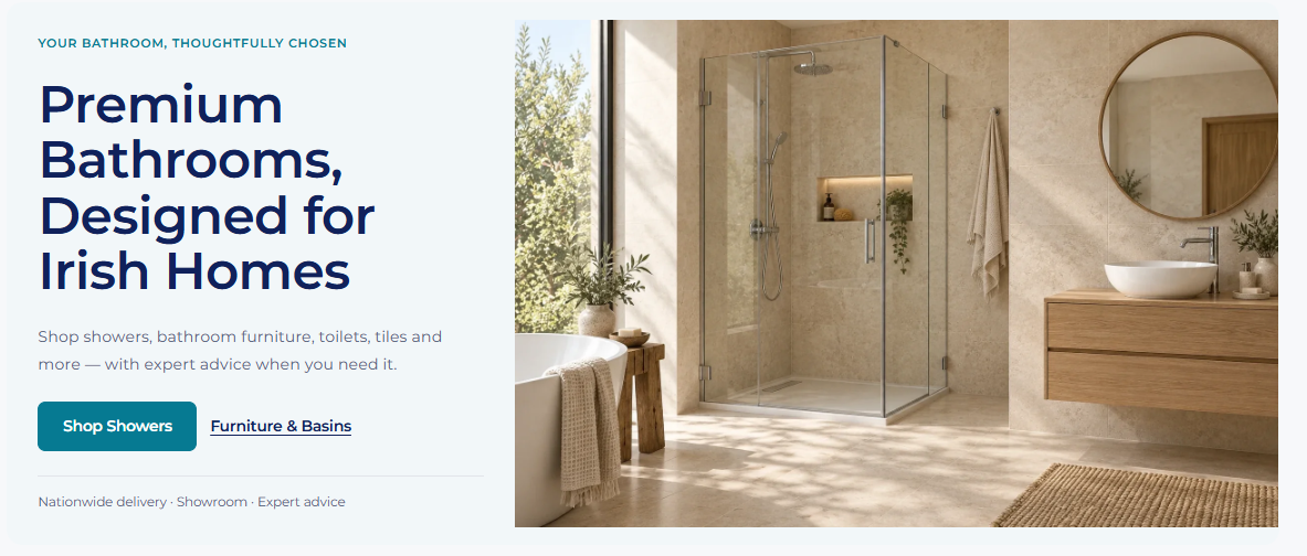
The homepage has several jobs: establish trust, explain the offer and help visitors move towards the right products. It should not become a sequence of oversized promotional banners that delays access to the catalogue.
That overlap matters beyond conversion. Website design decisions can also affect search visibility when they create problems with mobile usability, performance, crawlability or access to content.
In the original audit, the main hero occupied a large proportion of the first screen. The recommendation was not to eliminate strong imagery, but to prevent it from creating a false end to the page or pushing every useful route below the fold.
The current homepage introduces the business, provides direct calls to action and then presents a clear “Shop by category” section covering furniture, toilets, baths, basins, taps and tiles. This makes the breadth of the catalogue easier to understand.
For most ecommerce homepages:
- Keep the proposition and primary action concise.
- Let at least part of the next useful section appear near the fold.
- Give major product categories more prominence than short-lived promotions.
- Use category images that genuinely distinguish one route from another.
- Avoid relying on a carousel to communicate several important messages.
Action: View the homepage on the most common mobile viewport and ask what a new visitor can do without scrolling. If the answer is only “look at the hero image”, the page is probably not working hard enough.
Measure: Click-through rate from the hero and category cards, depth of scroll, product discovery and homepage exit rate.
Hero Banner: Before
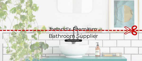
Hero Banner: After
5. Turn collection pages into decision-making tools
A collection page should do more than display a grid of products.
The original /collections experience mixed categories, brands, colours, styles and other classification methods into one long alphabetical list. Technically, everything was available. Practically, the customer had to work out the structure for themselves.
A better collection experience begins with the decisions that matter for that product. On the current Shower Doors page, visitors can first choose how the door opens, then narrow the range by width and finish before comparing products. Short explanations help customers understand why sliding, bi-fold, hinged and frameless options suit different spaces.
This is especially valuable for considered purchases. Customers may not know the correct product term when they arrive, but they usually understand the problem they are trying to solve: limited floor space, a non-standard opening or a particular finish.
It is also a better balance between ecommerce SEO and UX. Helpful introductory content can explain the category, but a long keyword-led block should not bury the products or filters. Detailed buying advice can sit lower on the page, where it supports customers who need it without delaying everyone else.
Action: For each major collection, identify the first two or three decisions customers normally make. Turn those decisions into visible category routes, promoted filters or short decision helpers.
Measure: Clicks on curated category routes, collection-to-product click-through rate, filter use and collection-page exits.
Collection Page: Before
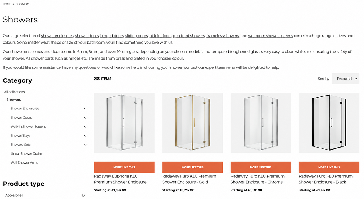
Collection Page: After
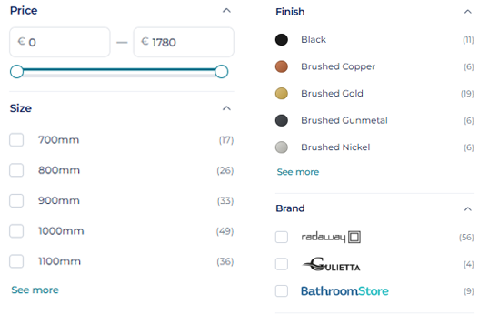
6. Promote the filters that matter most
Filters are essential when a category contains dozens or hundreds of similar products. Their purpose is to reduce a broad list to a manageable set—not to reproduce every piece of product data in a sidebar.
For bathroom products, useful filters are often highly practical: width, height, finish, opening type, brand, stock status and price. These are much more helpful than internal attributes customers do not understand.
The original audit recommended promoting important subcategories and filters above the product list. Current research on promoted filters continues to support this approach, particularly on mobile where the complete filtering interface is normally hidden.
Good filtering also requires interaction details:
- Display the number of matching products where useful.
- Show selected filters clearly above the results.
- Let customers remove one filter without clearing everything.
- Use “See more” rather than a small scrolling box inside the filter panel.
- Provide typed minimum and maximum values if a price slider is difficult to control.
- Avoid showing empty or irrelevant options.
- Update the results predictably and preserve selections when visitors return from a product page.
Action: Review filters using real customer tasks. “Find a black 900mm bi-fold shower door” is a much better test than checking whether each filter technically opens.
Measure: Filter adoption, zero-result combinations, products viewed after filtering and the rate at which filters are removed or reset.
Filters: Before
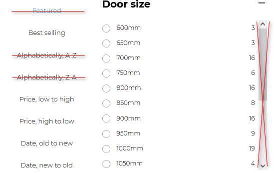
Filters: After
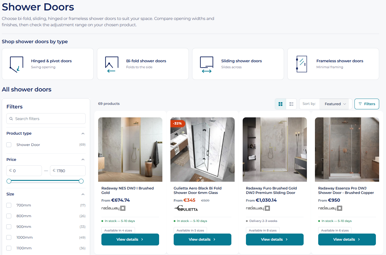
7. Make product cards answer the first questions
A product card needs to give customers enough information to decide whether opening the product page is worthwhile.
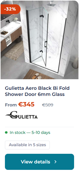
The answer depends on what is being sold. A repeat purchase with one obvious configuration may suit a quick “Add to basket” action. A shower door available in several sizes and finishes requires closer examination. In that situation, “View details” is more honest and less likely to encourage an incorrect selection.
The current Bathroom Store Ireland product cards show:
- Product name.
- Current and previous price where applicable.
- Discount percentage.
- Stock or delivery information.
- Number of available sizes.
- A clear “View details” action.
This allows visitors to compare meaningful differences before entering a product page. It also avoids hiding essential actions until someone happens to hover with a mouse—a behaviour that does not translate to touchscreens.
Action: List the three questions customers ask before opening products in each major category. Put the answers on the card where the data is reliable and can remain up to date.
Measure: Product-card click-through rate, quick-add errors, product-page exits and returns caused by choosing an incorrect variant.
Product Card: Before
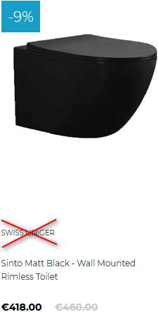
Product Card: After
8. Present prices and savings without making customers calculate
Sale pricing should be clear without becoming visually aggressive.
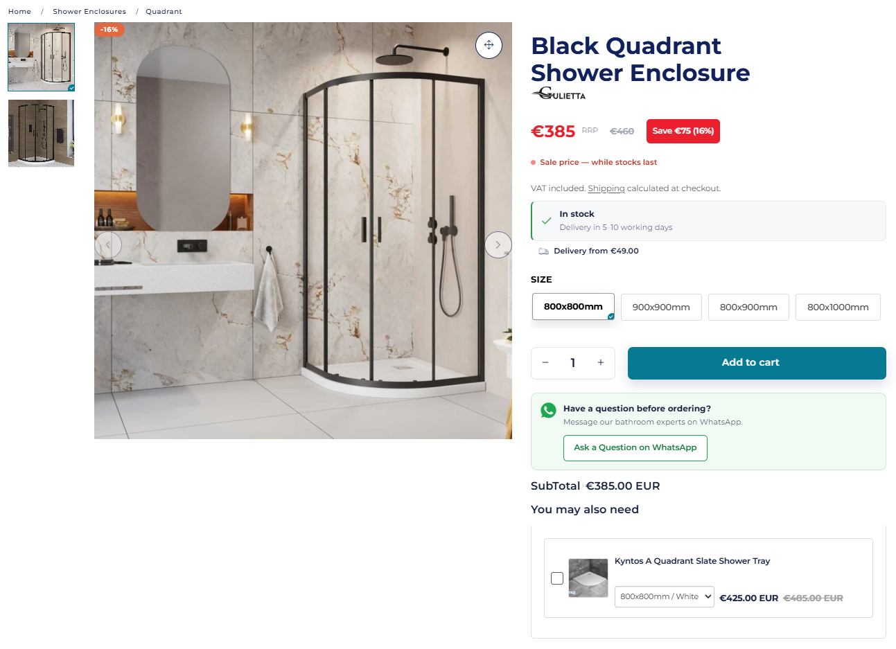
The current product page for the Gulietta Black Quadrant Shower Enclosure provides the selling price, recommended retail price and both forms of saving: “Save €75 (16%)”. That lets the customer understand the offer without doing mental arithmetic.
The most important principle is hierarchy—not a supposedly universal “conversion colour”. The current price should be easiest to find, the previous price should remain legible but visually secondary, and the saving should be explained in plain language. Colour can reinforce the message, but it should never be the only way a discount or status is communicated.
Action: Check sale items on desktop and mobile. Can a visitor identify the price they will pay, the previous price and the saving within a few seconds? Confirm that screen readers and users with colour-vision differences receive the same information.
Measure: Interaction with sale products, add-to-basket rate and customer-service questions about pricing.
Product Page: Before
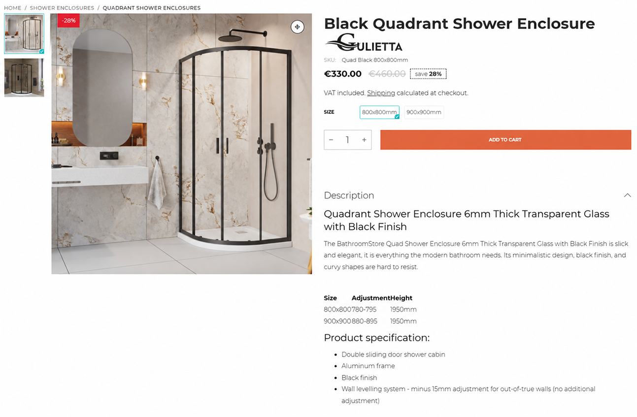
Product Page: After
9. Put stock, delivery and returns beside the buying decision
Delivery is not a minor detail when customers are buying baths, vanity units, shower glass and other oversized items.
The customer wants to know three things before adding a product to the basket:
- Is it available?
- When is it likely to arrive?
- What will delivery cost?
Hiding those answers in a policy page or waiting until late checkout creates uncertainty at exactly the point where the customer is deciding whether to proceed.
The current Gulietta product page displays “In stock”, an estimated delivery window of 5–10 working days and delivery from €49 near the purchase controls. It also provides a clear returns summary explaining 14-day returns, a 45-day exchange period for eligible incorrect sizes and the exception for custom-made products.
This reflects two enduring findings from ecommerce UX research: provide an estimated delivery cost on the product page and communicate a useful delivery date or date range, rather than making the customer calculate it from a dispatch speed.
Where the exact charge depends on location, show a realistic starting price or range and explain how to obtain a precise quote. It is better to acknowledge a variable cost than to leave the impression that delivery may be unexpectedly expensive.
Action: Place stock status, delivery estimate, delivery cost and a short returns summary close to the main purchasing action. Keep the full policies available through clearly labelled links.
Measure: Add-to-basket rate, basket abandonment, delivery enquiries, returns-policy visits and cancellations caused by delivery expectations.
10. Use reassurance where hesitation occurs
Trust is not created by adding as many badges as possible. It comes from giving customers credible evidence and access to help when they need it.
The original audit identified customer ratings and reviews as a major opportunity. The current site now shows its Google rating in the announcement bar and adds practical reassurance throughout the journey: a physical Dundalk showroom, a telephone number, nationwide delivery, expert advice and a direct WhatsApp route for pre-purchase questions.
Product-level reviews can provide another layer of confidence, especially when customers need to judge quality, installation or how an item looks in a real bathroom. Baymard’s research has found that reviews are heavily used on conventional ecommerce sites. However, an empty review widget is not useful. Retailers need a genuine process for requesting, moderating and responding to reviews.
For higher-value products, human support can be just as important. Give customers a clear way to ask about measurements, compatibility and delivery without forcing them to abandon the product page.
Action: Identify the main source of anxiety at each stage and place the relevant reassurance there. Use evidence—reviews, clear policies, real contact details and knowledgeable support—instead of generic “100% secure” graphics.
Measure: Review volume, interaction with support options, assisted conversions and the subjects of pre-purchase enquiries.
11. Show the full cost and remove avoidable checkout work
The basket and checkout should confirm the decision, not introduce new uncertainty.
For large products, the most important requirement is a clear total. Customers should not need to provide their full details before discovering a delivery charge that changes the affordability of the order. If an exact cost genuinely requires a postcode or location, explain that early and calculate it with the minimum information necessary.
The original audit also identified several smaller sources of checkout friction:
- Discount-code fields given too much visual prominence.
- Labels placed inside fields and disappearing as customers type.
- Optional address information appearing mandatory.
- Low-contrast form borders and controls.
- More fields than the transaction required.
Current checkout field research recommends reducing the number of fields customers must consider, hiding infrequently needed fields such as Address Line 2 behind a link and collapsing promotional-code entry. Visible labels also help customers understand and correct their information; the W3C form guidance explains why controls need clear, persistent labels.
This is not about chasing the shortest-looking checkout. It is about removing decisions and fields that do not help complete the order.
Some improvements can be made through clearer content and configuration; others require changes to the theme, integrations or checkout journey. That is where conversion-focused ecommerce web development becomes part of the UX work.
Action: Complete a real mobile checkout using a test product and account for every piece of information requested. Remove, combine, automate or hide anything that is not required for payment, fulfilment, fraud prevention or a clear customer benefit.
Measure: Basket-to-checkout rate, checkout completion, errors by field, time to complete and abandonment by checkout step.
12. Separate urgent fixes from ideas that need testing
One of the most important parts of an ecommerce UX audit is knowing how confident to be in each recommendation.
A broken email link and a non-functioning price filter are defects. They should be fixed. A change to button colour, hero height or thumbnail position is a hypothesis. It may be sensible, but it should not be presented as a guaranteed conversion win.
We recommend placing findings into four groups:
Fix immediately
Broken functionality, accessibility barriers, misleading information, missing essential delivery details and serious mobile problems.
Prioritise for implementation
Evidence-backed improvements that address a clear customer need, such as prominent product search, usable filters and visible stock information.
Test or validate
Changes where the best answer depends on the audience, product and context, such as CTA treatment, quick-add behaviour, hero size or alternative mobile navigation.
Defer or reject
Low-impact cosmetic changes, ideas unsupported by evidence or recommendations whose implementation cost exceeds the likely benefit.
This distinction protects the business from spending time on fashionable design changes while basic obstacles remain unresolved.
Action: Give every finding an impact score, effort estimate, evidence level, owner and success measure. Implement related improvements in manageable groups and record the date of each release. If the measurement plan is unclear, start by choosing the digital marketing KPIs that most directly reflect the customer problem being addressed.
Measure: The metric connected to the original problem—not whether the new version simply looks better. Depending on the change, that may be product discovery, add-to-basket rate, checkout completion, customer enquiries or conversion rate.
The lesson: an audit only becomes valuable when it leads to action
The Bathroom Store Ireland project did not improve because a long PDF existed. It improved because the findings were discussed, prioritised, implemented and revisited as the catalogue and customer expectations changed.
The live store now makes several important tasks easier. Search is visible. Navigation supports different ways of shopping. Key collection pages guide customers through product decisions. Product cards surface delivery and variant information. Product pages explain price, saving, stock, delivery and returns before the customer commits.
The verified client feedback reported stronger engagement, lower bounce and a 20% uplift in conversion rate following the work. Just as importantly, the audit created a framework for ongoing decisions rather than a one-off redesign.
That is what a useful ecommerce UX audit should deliver: not a collection of opinions, but a prioritised plan for removing friction from the real customer journey.
A practical ecommerce UX checklist
Use these questions as a starting point:
- Is product search immediately visible and does it understand real customer language?
- Can customers navigate by product type, need, size or another meaningful attribute?
- Do breadcrumbs explain where the visitor is within the catalogue?
- Does the homepage provide clear routes into the main categories?
- Do collection pages help customers make the first important decision?
- Are the most useful filters easy to find and remove?
- Do product cards answer enough questions to justify a click?
- Are the current price, previous price and saving immediately clear?
- Can customers see stock, delivery time and likely delivery cost before adding to basket?
- Are returns, reviews and expert help available where hesitation occurs?
- Does the basket show a realistic total before checkout begins?
- Are audit findings prioritised by impact, effort and strength of evidence?
If several answers are “no”, changing the site’s appearance alone is unlikely to solve the underlying problem.
At SEO Impact, we combine UX and UI, development and ecommerce SEO to improve how online stores are found and how effectively they turn relevant visits into sales. Explore our Shopify development services or contact us for an honest review of where your store may be losing customers.
